Version 1.0 · October 2026
Limitless Advancements identity manual
The logo, colour, type and voice of Limitless Advancements, with every official file. For staff, partners, printers, press and anyone making something in our name.

01
Brand
Limitless Advancements supplies research-grade peptide reference materials to laboratories and researchers in Canada. The identity has one job: to look as exact as the material we ship.
Canadian fulfilment
Orders are fulfilled within Canada and shipped to verified buyers in Canada.
Documented quality
Purity ≥98% (HPLC). Request the certificate of analysis (COA) for the lot you receive.
Any scale
Orders of any size, with volume pricing for programmes that need it.
Research use only
Sold to verified buyers in Canada, aged 21 and over, for in-vitro work. No human-use claims, ever.
Personality
Naming
- Write the full name, Limitless Advancements, on first mention. After that, Limitless is fine.
- Advancements is always plural.
- In running text, use title case. Capitals belong to the logo only.
- Do not shorten the name to LA in public copy. LA is the prefix of our lot codes (LA-B157-2406).
- The web address has a hyphen: limitless-advancements.com.
Correct
Limitless Advancements
Limitless
limitless-advancements.com
Incorrect
Limitless Advancement
LimitlessAdvancements
Limitless Labs, LA Peptides
limitlessadvancements.ca
02
Logo
The logo is the helix mark plus a two-line wordmark. It comes in three arrangements and four colourways. Always use the official files: the wordmark is outlined Helvetica Bold, spaced by hand, and cannot be retyped.
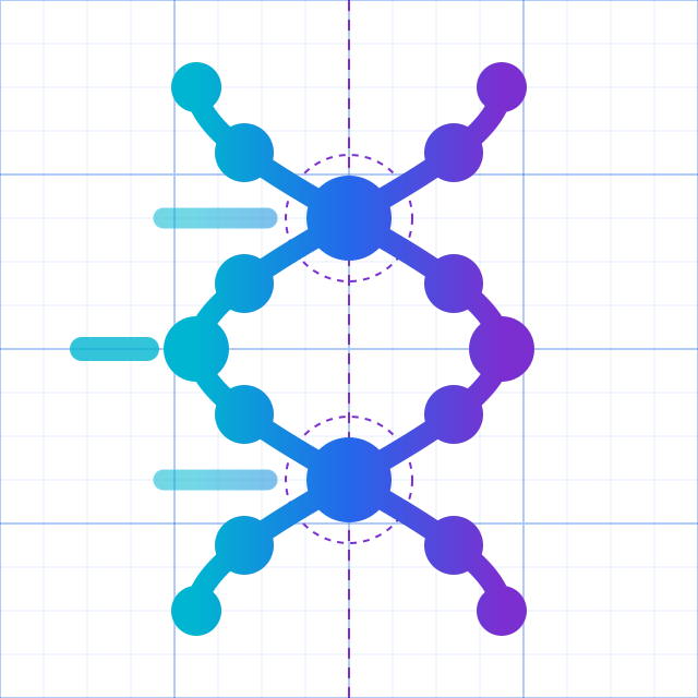
The idea: a dot helix
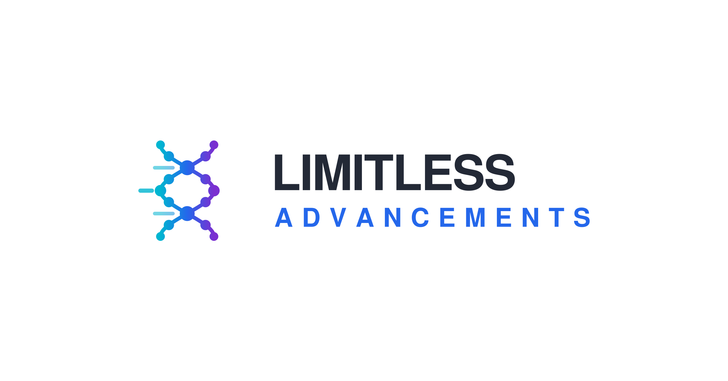
Two strands of nodes weave down a central axis and cross twice. At each crossing the strands share one larger node, the point where the two halves meet. The nodes suggest the building blocks of a molecule; the open shape between the crossings keeps the mark light.
Three tapered dashes trail to the left, so the helix reads as moving forward: the advancement in the name. Colour runs across the strands from Helix Cyan through Advance Blue to Helix Violet.
It is built from 16 nodes, 2 strands and 3 dashes on a 64-unit grid. Below 24 px the detail closes up, so small sizes use the simplified small mark, which drops the dashes and thickens the strands.
Arrangements

Primary. The site header, documents, email, anything wide.

Square and tall spaces: covers, signage, packaging, social posts.

When the name is already present, or space is very tight.
Horizontal lockup, four colourways
Stacked lockup


Mark, small mark and app icon














03
Construction
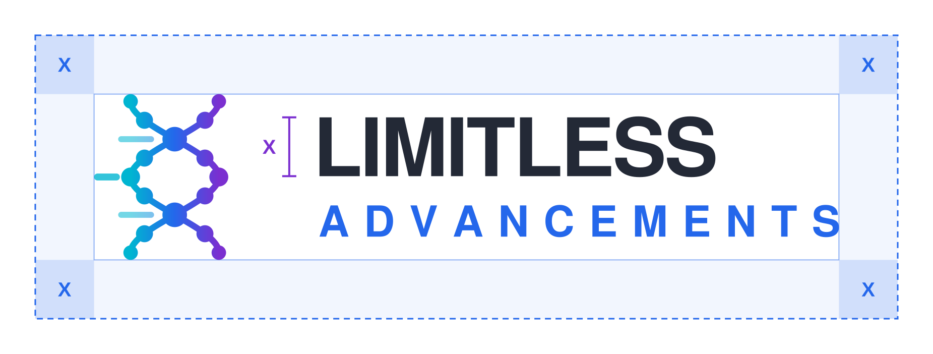
Every file is cropped to the edge of the artwork, so clear space and size are measured from what you can see.
Clear space
- X is the cap height of LIMITLESS in the lockup you are using.
- Keep at least X clear on every side: no text, edges, folds or other logos.
- For the mark on its own, X is one quarter of the mark's height.
- More space is always better. In the site header the lockup sits in a 64 px bar.
Minimum size
04
Backgrounds and misuse
Pick the colourway for the ground it sits on. If the logo has to fight its background, change the background, not the logo.
Approved grounds



Never do this
- Do not retype the wordmark, change its typeface, or rearrange the mark and the words.
- Do not use the original launch logo (the 2026 JPEG). The redrawn helix in these files replaces it.
- Do not lock the logo up with another brand's logo without written approval.
- Do not put the logo next to human-use or before-and-after content.
05
Colour
A white, quiet canvas with charcoal text, Advance Blue for action, and the helix gradient used sparingly. The values below are the live tokens in the site's stylesheet.
Brand
The three colours of the helix. Together they form the brand gradient; on their own they are accents, never backgrounds for long text.
Gradient start. Graphics only; too light for text on white.
Primary accent: links, buttons, ADVANCEMENTS, eyebrows.
Gradient end. Highlights and data accents.
Rare: deep accents in charts and print.
Neutrals
The site is a white canvas. Sections are separated by hairlines, not grey bands.
Default background and surface.
Subtle card and hover fills.
Hairlines, borders, dividers.
Secondary text and captions.
Body text and the LIMITLESS wordmark.
Dark
Dark is reserved for the home-page hero and the header and footer bands of printed documents.
Web hero background (behind the DNA video).
Print header and footer bands.
Accent text on dark, and ADVANCEMENTS on dark.
Support
Functional colours. Use them for states and documents, not for decoration.
Hover and pressed states of blue buttons.
Headings on printed documents.
Errors and compliance warnings.
Notice text, on #fff7ea with a #f0d9a8 border.
The helix gradient
linear-gradient(100deg, #00b5d1 0%, #2467eb 45%, #7b2fd0 100%)- Cyan to blue to violet at 100°, with blue at 45%. Never reverse it or add stops.
- Use it for the mark, 3 px hairlines, small accent bars and large display words.
- Never set body text, buttons or small labels in the gradient: the cyan end is too light to read.
Proportion
How much of a typical page or layout each colour covers.
- 64% White
- 16% Charcoal and Slate (text)
- 10% Ice and Mist
- 6% Advance Blue
- 4% Gradient
Contrast
Computed with the WCAG 2 formula. Body text needs 4.5:1. Text at 24 px and up, or 19 px bold and up, and graphics such as icons and the mark need 3:1.
| Pair | Ratio | Body text | Large text and graphics |
|---|---|---|---|
| Charcoal on White | 14.56:1 | Pass | Pass |
| Slate on White | 5.90:1 | Pass | Pass |
| Slate on Ice | 5.49:1 | Pass | Pass |
| Advance Blue on White | 4.98:1 | Pass | Pass |
| White on Advance Blue | 4.98:1 | Pass | Pass |
| White on Blue Pressed | 7.82:1 | Pass | Pass |
| Document Navy on White | 11.34:1 | Pass | Pass |
| Helix Violet on White | 6.65:1 | Pass | Pass |
| Helix Cyan on White | 2.46:1 | Fail | Fail |
| White on Night | 19.79:1 | Pass | Pass |
| Signal Cyan on Night | 11.54:1 | Pass | Pass |
| Advance Blue on Night | 3.97:1 | Fail | Pass |
| Helix Violet on Night | 2.98:1 | Fail | Fail |
The violet end of the helix sits just under 3:1 on Night. The colour mark is still approved on dark, because its blue core and shape carry it, but below 32 px on a dark ground use the white mark.
Print: there are no Pantone or CMYK references yet. Send printers the hex values, ask for a hard proof, and judge the blue against a screen showing this page.
06
Typography
One typeface, two weights. Helvetica is set everywhere, with Arial as the Windows fallback (it has the same widths, so layouts do not shift). No web fonts are loaded.
abcdefghijklmnopqrstuvwxyz
0123456789 · ≥ ± µg mL °C
abcdefghijklmnopqrstuvwxyz
0123456789 · ≥ ± µg mL °C
font-family: Helvetica, "Helvetica Neue", Arial, sans-serif;Scale
Hero headlines only
Page titles
Section titles
Cards and sub-sections
Running text
Captions, table cells
Labels above headings
- Bold is 700. Helvetica has no heavier weight, so never ask for 800 or 900: the browser fakes it and it looks smudged.
- Headings are tracked slightly tight (−0.02em). Body text is never tracked.
- Use sentence case for headings. Capitals are for eyebrow labels and the wordmark.
- Set numbers in data tables and labels with tabular figures (font-variant-numeric: tabular-nums) so columns line up.
- Chemical formulas use real subscripts, as in C₆₂H₉₈N₁₆O₂₂.
07
Graphic elements
A small kit of parts that make a page read as Limitless before the logo is seen.
Gradient hairline
3 px of the helix gradient under the compliance ribbon on every page, under the cover of every document, and across the top of email.
Measurement grid
A 44 px grid in Advance Blue at 5%, fading out from the top. It sits behind headlines on white and nowhere else.
Dark hero
Night, with the DNA film
The home page opens on Night with the DNA video at 50% opacity, white headlines and Signal Cyan accents. It is the only dark section on the site; everything after it is white.
Labels, chips and cards
Cards are white with a 1 px Mist border and 10 px corners; hover fills with Ice. No drop shadows, no grey section bands.
Research label
Products carry a pharmacy-style reference label: compound, molecular formula, components, purity method, presentation, barcode and lot code, with the research-use line always on the label. This is the live component, rendered with catalogue data.
Imagery
- Clean bench work: vials, glassware, instruments, chromatograms
- Cool, even light on white or Night
- Macro detail of material and labels
- Real lots and real certificates
- People, clinical scenes or medical devices
- Bodies, physiques, before-and-after
- Clinics or medical care
- Stock DNA clip art and lens flares
TB-500 (Thymosin β4)
Active fragment of thymosin β4
- Active ingredient
- TB-500 (Tβ4 fragment) 10 mg
- Molecular formula
- C₂₁₂H₃₅₀N₅₆O₇₈S
- Components
- Mannitol, Sodium phosphate (buffer)
- Purity
- ≥98% (HPLC)
- Presentation
- 10 mg lyophilized vial
Sample label · illustrative lot number
For laboratory research use only — not for human or veterinary use
08
Voice
We write like a careful lab colleague: exact, plain and unexcited. Research use is not a disclaimer we add at the end. It shapes every sentence.
Precise
Name the compound, the lot, the method. Numbers beat adjectives: say what was measured and how.
Plain
Short sentences, active voice, no hype. Write for a lab manager reading between experiments.
Transparent
Show the data. Every claim points to a certificate of analysis, a policy or a page.
Compliant by default
Research use only, every time. We never describe effects in people or animals.
Words
The research-use line
The short line goes on every product listing, label, ad, social post and document. The full text goes on product pages, invoices, certificates and anywhere a purchase is made.
Short
For laboratory research use only. Not for human or animal use. 21+. Canada only.
Full
All products offered by Limitless Advancements are chemical reference materials intended strictly for in-vitro laboratory research and development by qualified professionals. They are not drugs, foods, cosmetics, or natural health products. They have not been evaluated or approved by Health Canada, and they are not intended to diagnose, treat, cure, or prevent any disease or medical condition. Any form of human or animal administration is strictly prohibited. Products are sold exclusively to purchasers located in Canada who are 21 years of age or older.
09
Boilerplate
Approved descriptions for press, partner sites, directories and bios. Use them as written.
One line
Research-grade peptide reference materials for Canadian laboratories, with a certificate of analysis available on request.
Short (about 40 words)
Limitless Advancements supplies research-grade peptide reference materials to qualified laboratories, institutions and independent researchers across Canada. Purity is specified at ≥98% (HPLC) with identity confirmed by mass spectrometry; request the certificate of analysis (COA) for the lot you receive.
Long (about 90 words)
Limitless Advancements is a Canadian supplier of research-grade peptide reference materials for in-vitro laboratory research. Purity is specified at ≥98% (HPLC), with identity confirmed by mass spectrometry; request the certificate of analysis (COA) for the lot you receive. We supply orders of any size and fulfil domestically with tracked, insured shipping. Products are sold for laboratory research use only, to verified purchasers in Canada aged 21 and over.
10
Applications
Specifications for the places the brand shows up most.
Website header
- White bar, 64 px tall, under the compliance ribbon and its gradient hairline.
- Horizontal lockup with a 40 px mark; navigation in 14 px Slate, Charcoal on hover.
Favicon and app icon
- Browser tab: the small mark (src/app/icon.svg).
- Home screen and app stores: the app icon, white helix on the gradient tile.
Social profiles
- Avatar: the app icon (PNG 1024). It survives circular crops.
- Banner and link previews: the light or dark board, 2400 × 1256 (1.91:1).
- Every post carries the short research-use line.
Documents and PDFs
- US Letter. Ink header and footer bands with the colour-on-dark lockup.
- Headings in Document Navy, body in Charcoal, accents in Advance Blue.
- The full research-use text on the last page.
Product labels
- The research label above: white stock, Charcoal text, lot code and barcode.
- The short research-use line on every label, at 6 pt or larger.
Shipping
- Plain outer cartons with no product names. The logo appears only inside.
- Insert card: stacked lockup, the lot's COA reference and the full research-use text.
Email signature
Full Name
Role · Limitless Advancements

research@limitless-advancements.com
limitless-advancements.com
For laboratory research use only. Not for human or animal use. 21+. Canada only.
- Name in Bold, role and company in Regular Slate, 14 px.
- Lockup PNG displayed at 180 px wide (the 2400 px file stays sharp on retina screens).
- Links in Advance Blue. No quotes, banners or extra images.
- The short research-use line, 11 px, at the end.
11
Downloads
Everything above in one file, or one at a time. SVG first; PNG when a tool cannot take vectors.
Complete brand kit
All SVG and PNG logos, the app icon, both boards, brand.json and a one-page README.
Horizontal lockup
Stacked lockup
Mark and icons

Ready-made boards (1.91:1)

12
Checklist
Run through this before anything with our name on it goes out.
- 1The logo comes from an official file, not a screenshot or a retyped wordmark.
- 2The colourway matches the ground: colour on light, colour on dark on Night or Ink, white or black for one colour.
- 3Clear space of at least X (the cap height of LIMITLESS) on every side.
- 4Larger than the minimum size, and the small mark below 24 px.
- 5Type is Helvetica (Arial on Windows), Regular and Bold only.
- 6Text contrast is at least 4.5:1, or 3:1 for text 24 px and larger.
- 7The research-use line appears on every product, label, ad and document.
- 8No human-use, therapeutic or before-and-after language or imagery.
- 9Contact is research@limitless-advancements.com and the site is limitless-advancements.com.
Questions and approvals
For anything this manual does not cover, a co-branding request, or a file in another format, write to research@limitless-advancements.com. Manual version 1.0, October 2026.